Effective B2B media monitoring (minus the cost)

[vc_row][vc_column][vc_column_text]Almost everyone working in PR and communications with B2B companies struggles with media monitoring. When I have conversations with clients about this, they typically complain about one of the following:
- The time spent manually compiling all the information and then getting it into a sensible and presentable format from which it's possible to derive some intelligence
- The cost of the mainstream, third-party, media monitoring platforms - the investment required can represent a significant proportion of the overall communications budget
- The 'false positives' inevitably picked up by all media monitoring platforms - we've all seen the worthless press release reprints on totally irrelevant websites that can take hours to weed out
- The missing coverage - no matter what you're paying for a media monitoring platform, for some reason, they always seem to miss important coverage
Here at Babel, we feel the pain on behalf of our clients, not all of whom can afford to put a heavyweight media monitoring platform in place or to pay for the hours required to set up and manage it. We wanted to provide a solution that delivers intelligence without breaking the bank.
The good news is, with a little ingenuity, it's possible to get things done much more cost-effectively and still come up with a highly effective analysis that not only provides insight into how your campaign is progressing, but also provides pointers for improvement.
Our starting point for this approach is Google, and in particular, Google's ability to search within specific domains (e.g. zdnet.com). You see, in the B2B world, we can pretty much identify every important online media outlet for a specific client (trades, vertical, general business etc.) - you might have a hundred or more but you know which they are. With that information to hand, you can then ask Google to search the domain of that media title and to specify the date parameters you are interested in.
Of course, doing this for a hundred domains would be time-consuming, so we developed a means to automatically create Google search parameters that would search multiple domains at the same time. The example below searches 25 separate domains for 'Cisco Wi-Fi OR WiFi' with the results restricted to those between 1st April 2017 and 31st March 2018 (it also gets Google to produce 100 results per page instead of the usual 10).
The URL gives you a Google output that looks like that shown left:

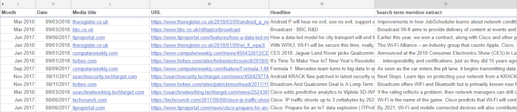
You can see from the results that we have a date, a headline, an article summary, a linking URL and the media outlet (part of the URL). That's what you need as the basis of your media analysis.
The next step is to get all of that data into a spreadsheet so that you can interrogate and manipulate it. There are a number of ways of doing that and if you aren't comfortable with data extraction techniques, the simplest way is to copy and paste it. You'll then need to use some advanced spreadsheet formulas to separate the individual data elements into rows and columns. It needs to look something like the screenshot below, and this is a good time to weed out any obvious anomalies (easy to achieve by filtering on columns):
If you are doing a comparative analysis, you'll need to do the same for the other companies you are looking at and, in the example used here, as well as Cisco, we have extracted data related to Aruba, Huawei and Juniper Networks within approximately 40 media title domains.
Once you have all the data in raw format, you can use some more spreadsheet trickery to interrogate and manipulate. The following are a range of charts that can be produced easily:
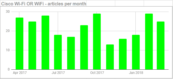
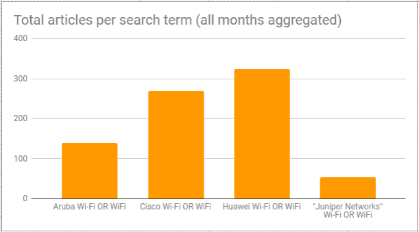
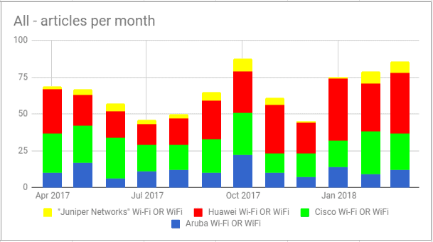
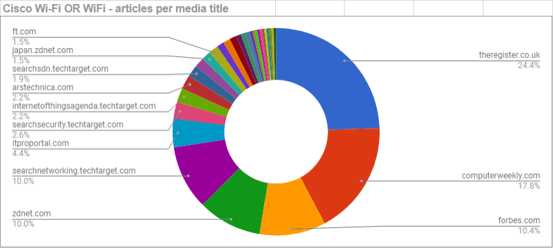

Most of these charts are self-explanatory and recognisable as the basis of a standard comparative media analysis. The chart directly above goes a little further and maps the impact each of the four companies has made in each of the media titles. It's an incredibly useful metric to guide future outreach. If you like, you can add your own data elements - for instance, allocating a sentiment score.
At Babel, we've invested time into building a master spreadsheet template that automates most of the process, including creating the search domains and search terms from a list of email addresses or websites to the creation of all the charts. It takes the raw output from Google, extracts the individual data points and builds all the charts without any significant user intervention.
So there it is, very effective media monitoring that doesn't require a huge investment. If you'd like to learn more about this approach, let us know.[/vc_column_text][/vc_column][/vc_row]